top of page


How to Build a Light/Dark Mode Theme Switch in Power BI 🌓 (No DAX, With Accessibility in Mind)
Give your users control in Power BI with a Light/Dark Mode switch using just a table, a slicer, and conditional formatting. No DAX needed.
Oct 16, 20253 min read


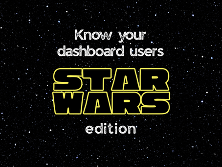
Star Wars Dashboard Personas for UX-Driven Design: Know Your Audience, You Must
From strategic leaders to precision specialists, these Star Wars-inspired dashboard personas reveal why some reports succeed while others fall flat—and how UX design can make all the difference.
Aug 13, 20254 min read


Drop the Shadow: Rethinking Drop Shadows in Power BI
Drop shadows in Power BI might look stylish, but they often hurt clarity, accessibility, and UX. Here’s why—and the simple design tweaks that work better.
Jul 3, 20252 min read


Power BI Padding Tips: The Sacred Space Between Chaos and Clarity
Now that we’ve all learned to love rounded corners , let’s talk about another quiet champion of good design: padding . You know, that...
Jun 11, 20254 min read


The Power BI Accessibility Checklist ✅ - With Tips, Tools & Real-World Examples
Make your Power BI reports more accessible with this practical checklist. Covers alt text, keyboard navigation, color contrast, and more.
May 21, 20253 min read


Curves Ahead: Rounded Corners in Power BI Without Losing the Edge
I’ve been seeing all kinds of shapes in Power BI reports lately—and seems like there's a lot of guesswork when it comes to rounded...
Apr 30, 20254 min read


Custom Fonts in Power BI: Yay or Nay? (And How to Make It Work)
Custom fonts in Power BI can take your reports from “meh” to memorable. They add polish, personality, and branding—but only if you know how to use them without breaking your design.
Nov 20, 20245 min read


Finding My Voice: A Journey of Speaking and Growth
One year, a dozen stages, countless butterflies. This is the story of how I went from terrified rookie to loving every minute on stage.
May 31, 20245 min read


Accessibility features in Power BI you probably didn't know existed
Power BI has hidden accessibility features that can make your reports clearer, friendlier, and usable for everyone. Here’s how to find them—and why adding them takes less effort than you think.
Apr 5, 20244 min read


Whitespace: How LESS brings MORE clarity and impact in your Power BI reports
Ever received feedback from a client that there's too much unused space in the report you created? And their suggestion: why not just...
Feb 28, 20244 min read


Color me impressed: Everything you need to know about colors in Power BI
The right colors in Power BI can transform a report from bland to brilliant. Start by choosing a balanced palette based on color theory, and apply the 60-30-10 rule to keep visuals intentional and easy to read. Ensure accessibility with high-contrast text and color-blind-friendly combinations, and use tools like Adobe Color Accessibility Checker to verify. In this guide, we’ll cover everything from color psychology to accessibility so your Power BI reports look polished and
Feb 4, 20244 min read


What on Earth is UX Design and why does it matter in Data Visualization?!
UX design puts your audience first, making reports intuitive and easy to use. Here’s why it’s a game-changer in data visualization (and what doors have to do with it).
Jan 15, 20242 min read


Aiming for the Moon with MoonStory: Where Power BI Meets UX Design
MoonStory is where data meets design. Follow along for Power BI tips, UX best practices, and stories from the data community—always aiming for the moon.
Jan 3, 20243 min read
bottom of page
